Flagship course
Service Health Dashboards
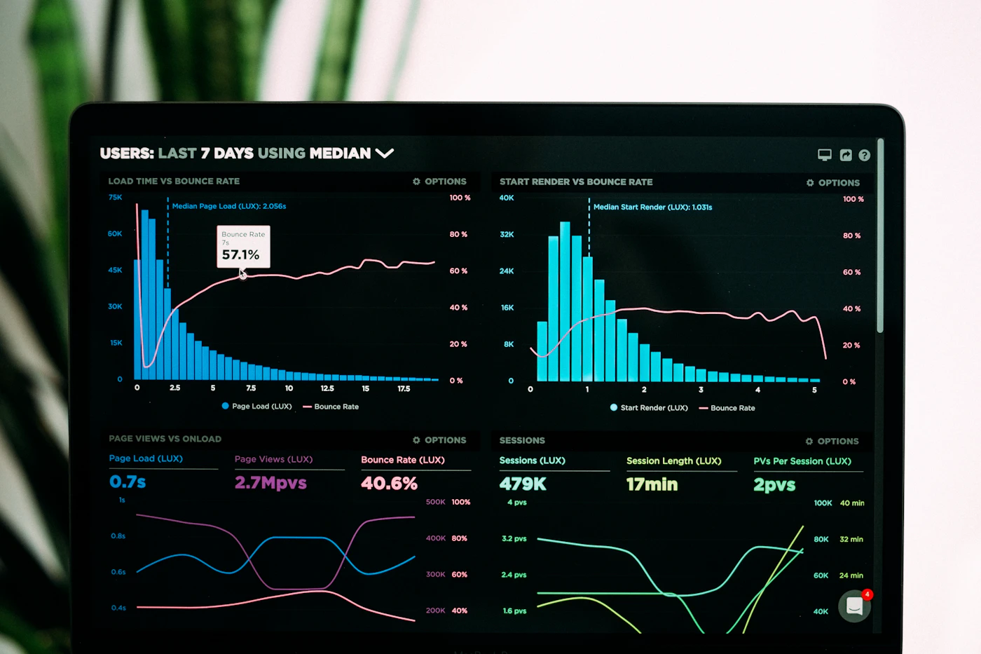
An eight-week cohort for people who must turn noisy telemetry into a durable visualization and analytics approach for IT service health tracking.
Learning outcomes
- Define a service health model that separates leading indicators from lagging pain.
- Compose primary and drill-down boards that keep severity readable under stress.
- Wire correlation views across metrics, logs samples, and change calendars.
- Facilitate a monthly health review with stakeholders who are not on-call.
- Document visualization decisions so the next engineer can maintain the board.
At a glance
Format: Live cohort + async critiques
Duration: 8 weeks · ~6 hours per week
Tools: Tool-agnostic; Grafana, Looker Studio, Power BI, or custom stacks welcome
Price (informational): MYR 4,850 per seat — see pricing for tier context. No checkout on this site.
Modules
-
Health vocabulary & boundary maps
Align on what “healthy” means per service tier. Draw dependency envelopes before opening a chart editor.
-
Signal selection & sampling honesty
Choose SLIs, error budgets, and saturation proxies. Practice labeling partial data so viewers never mistake silence for green.
-
Primary board composition
Build the five-second view: status, trend, and blast radius. Critique sessions focus on hierarchy, not decorative flourishes.
-
Correlation & change overlays
Layer deployments, tickets, and third-party status. Learn when juxtaposition helps and when it invents false causes.
-
Stakeholder narratives & handoff kits
Package weekly digests, escalation snippets, and a maintenance runbook so boards outlive the cohort.
Instructor

Farah Lim
Farah spent a decade in reliability and analytics roles for logistics and telco platforms in Malaysia and Singapore. She now coaches teams on turning observability estates into decision surfaces — with a bias toward readable restraint over chart sprawl.
Course FAQ
Do I need a specific visualization tool?
No. Critiques evaluate signal design and layout logic. You may use Grafana, Power BI, Looker Studio, Metabase, or internal tooling. We do not provide vendor licenses.
Can I join if my data cannot leave the company network?
Yes. Many learners use synthetic series or redacted exports. Screenshare during critique is optional; annotated stills are accepted.
What is a real limitation of this course?
We do not implement pipeline engineering or agent installation. If your telemetry is missing or broken, visualization practice alone will not invent trustworthy signals — you will need platform work in parallel.
Is payment handled on this website?
No. Pricing here is informational. Enrolment and invoicing happen through a separate conversation after you contact us.
Learner notes
Module 4 forced us to put change markers on the same canvas as latency. We caught a weekly batch job we had blamed on “network weather” for months.
★★★★☆Clear facilitation. The peer critique template is something I still paste into Confluence. Deducted a star because the sample dataset for retail POS was thinner than the cloud-native one.
Next cohort seats
Share your role and current tooling. We will confirm dates and send informational fee details — no payment form on this page.
Request cohort details