SystemNode Core
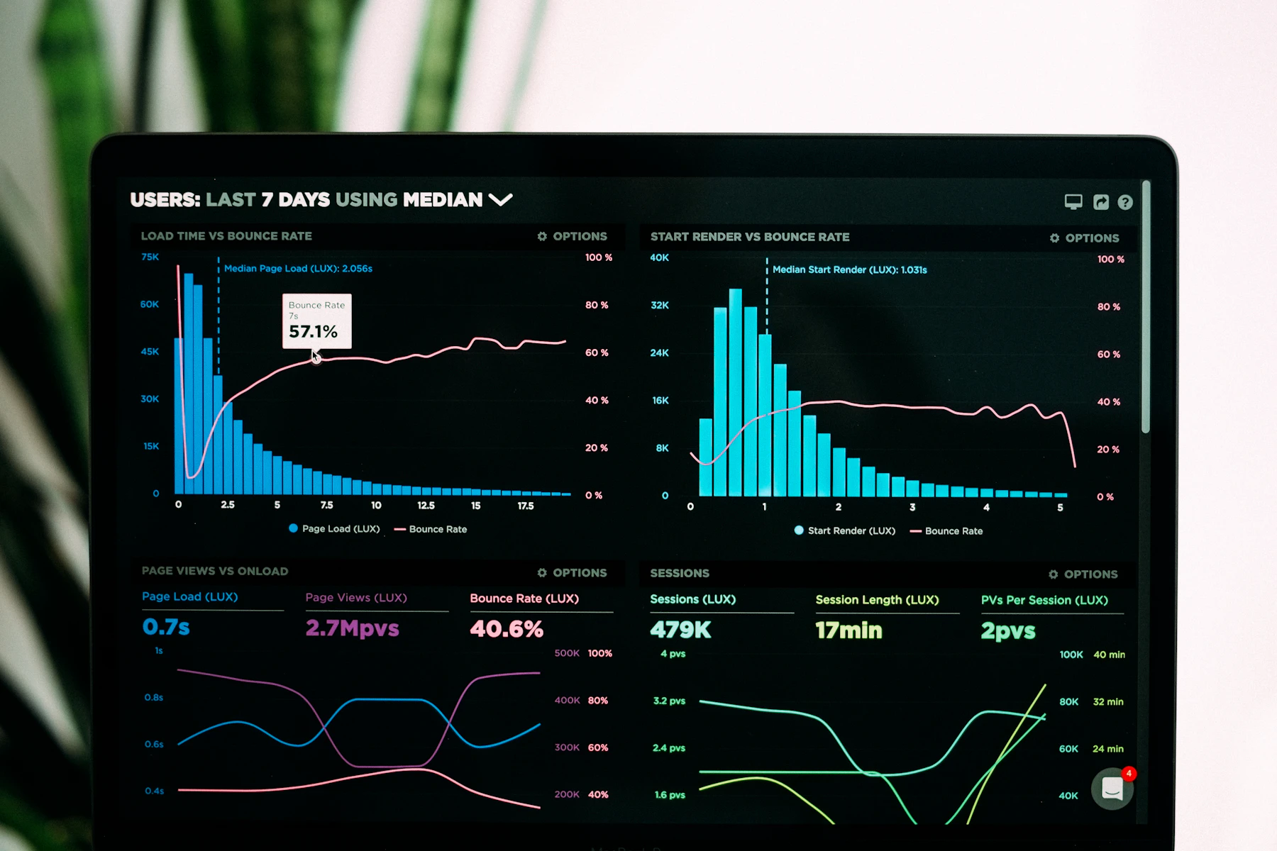
Training for teams who need a data visualization and analytics platform for IT service health tracking — built around signal clarity, not chart decoration.
What you practice
From raw telemetry to views your on-call can trust
Signal taxonomy before visuals
Map availability, latency, error budgets, and dependency health into a vocabulary your tooling and humans share.
Layouts that survive night shifts
Design density, contrast, and hierarchy so a 3 a.m. page load still communicates severity in under five seconds.
Correlation without noise
Join infrastructure metrics with ticket and change data so spikes explain themselves instead of spawning guesswork.
Malaysia-ready delivery habits
Patterns that fit distributed teams, regional latency realities, and stakeholder updates in EN for mixed technical audiences.
Featured program
Flagship course
One deep track for analysts and SRE leads who own the health story of their services.


From learners
What changed after the boards shipped
After Module 3 on dependency heatmaps, our change-window reviews stopped arguing about “which graph.” We argued about thresholds instead — slower meetings, but fewer false escalations.
The Service Health Dashboards critiques were blunt about our color legend. Useful. Still wish the peer review slots ran longer than 25 minutes when the backlog was thick.
Field guide
Service health tracking as a practice, not a gadget
Our optional deep-dive page walks through how SystemNode Core frames telemetry, narrative, and ops ritual together.
Open the guide
Ready to clarify your service story?
Tell us about your stack and audience — we reply within two business days with a course fit or a polite redirect.
Contact SystemNode Core